
MuckRock
UX Designer & Visual Designer ········· Rayne Schulman
Visual Designer ········· Christine Seungmin Roh
UX Designer ········· Ying Chen
UX Researcher ········· Fengyue Kiana Hu
Visual Designer ········· Christine Seungmin Roh
UX Designer ········· Ying Chen
UX Researcher ········· Fengyue Kiana Hu
Challenge.
Muckrock is a non-profit organization that facilitates access to public records and is currently the only organization that offers this kind of service. However, the website is severely outdated.
Solution.
Re-design the filing a request and individual request pages to be intuitive and user friendly while still maintaining all the features of the current website.

Personas &
User Stories.
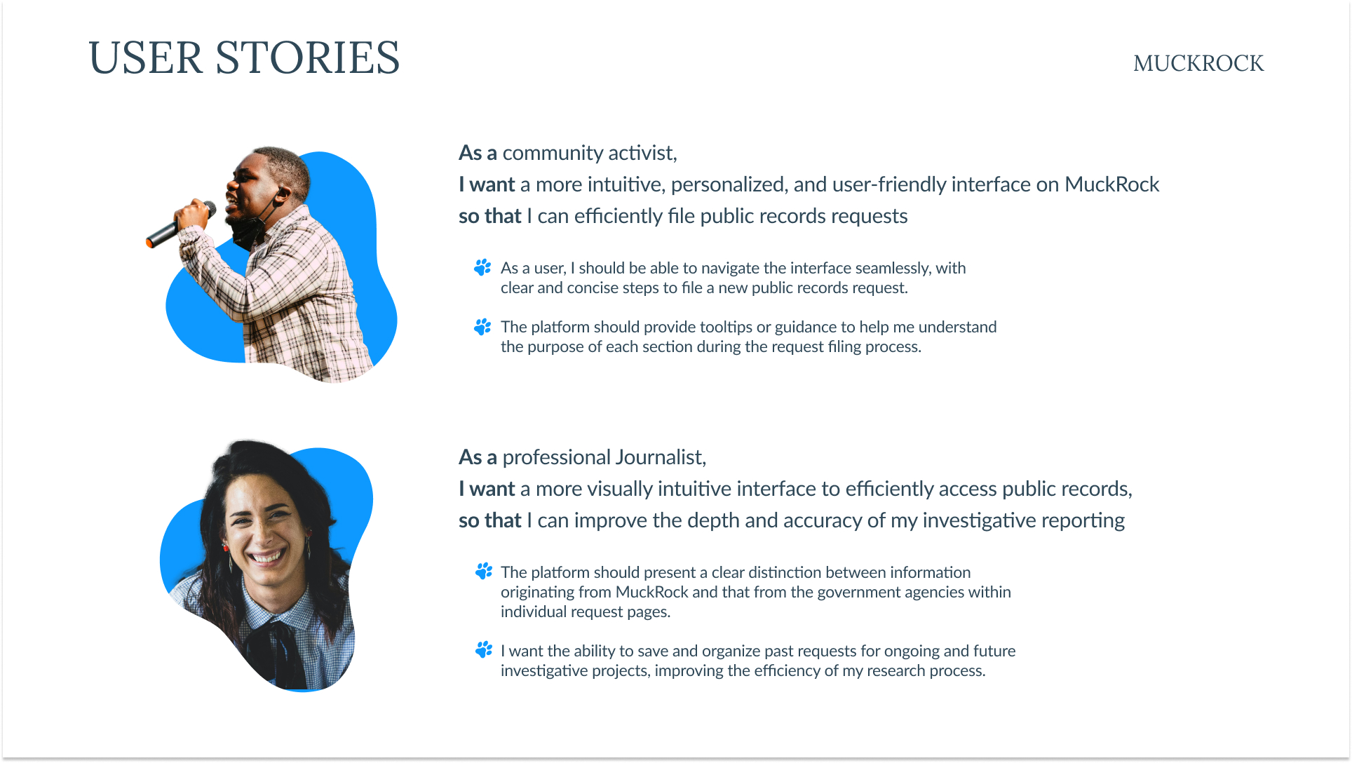
User Stories.
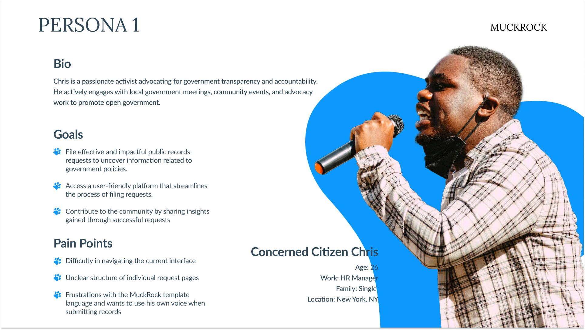
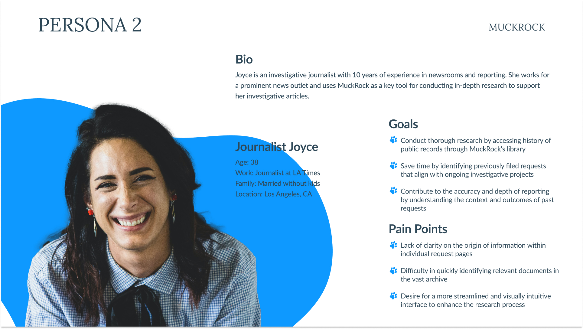
After conducting in-depth interviews with both longtime and novice users, we created two personas based off of the two distinct user groups of MuckRock.
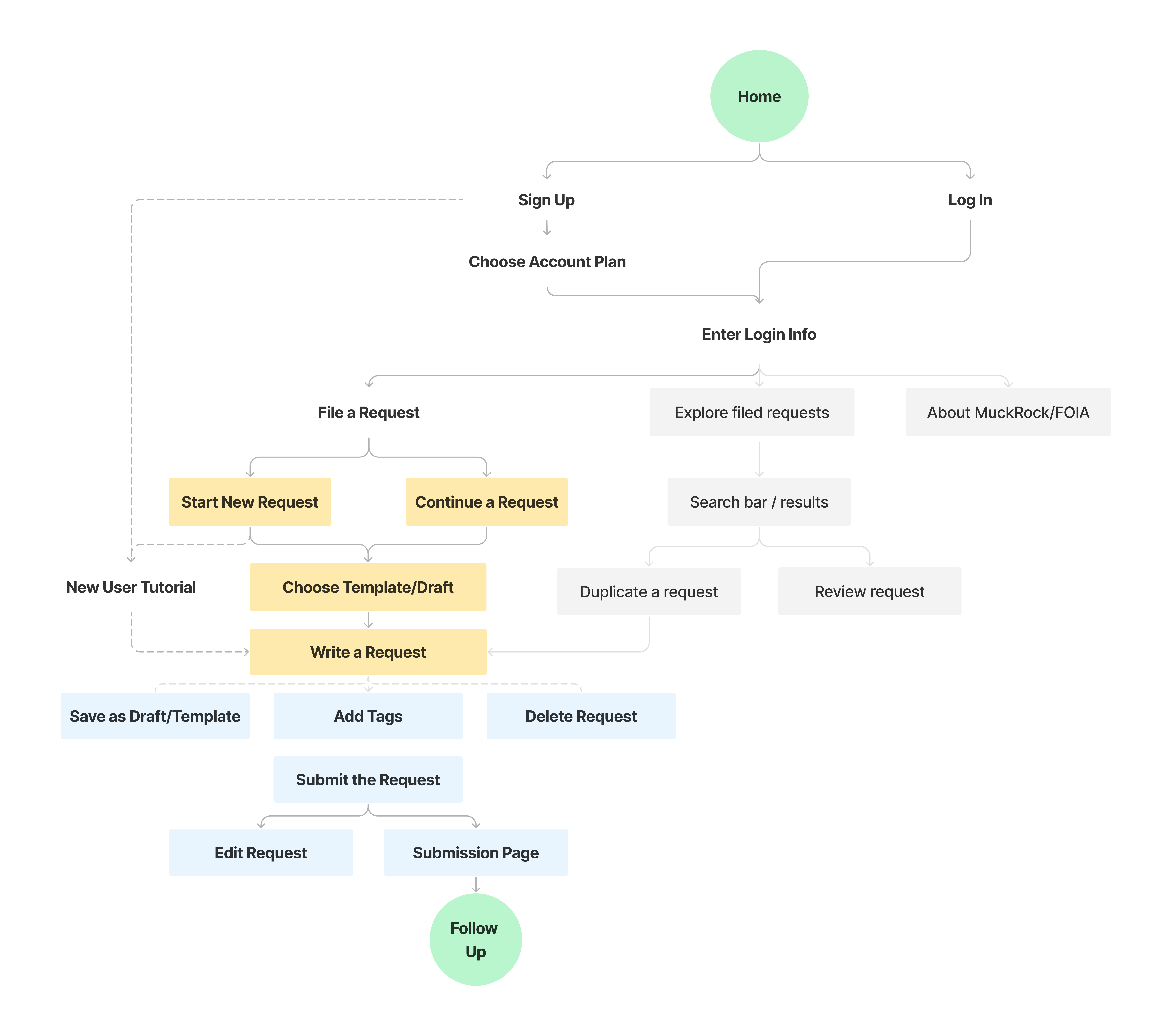
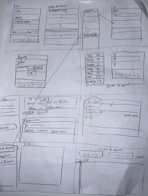
User Flow.
From the interviews we created a new feature: custome templates. Power-users were looking for a way to streamline the filing process and other users were looking for a way to insert their own voice into their requests. We mapped out the flow the whole user experience but what we mainly focused on is the highlighted portions.
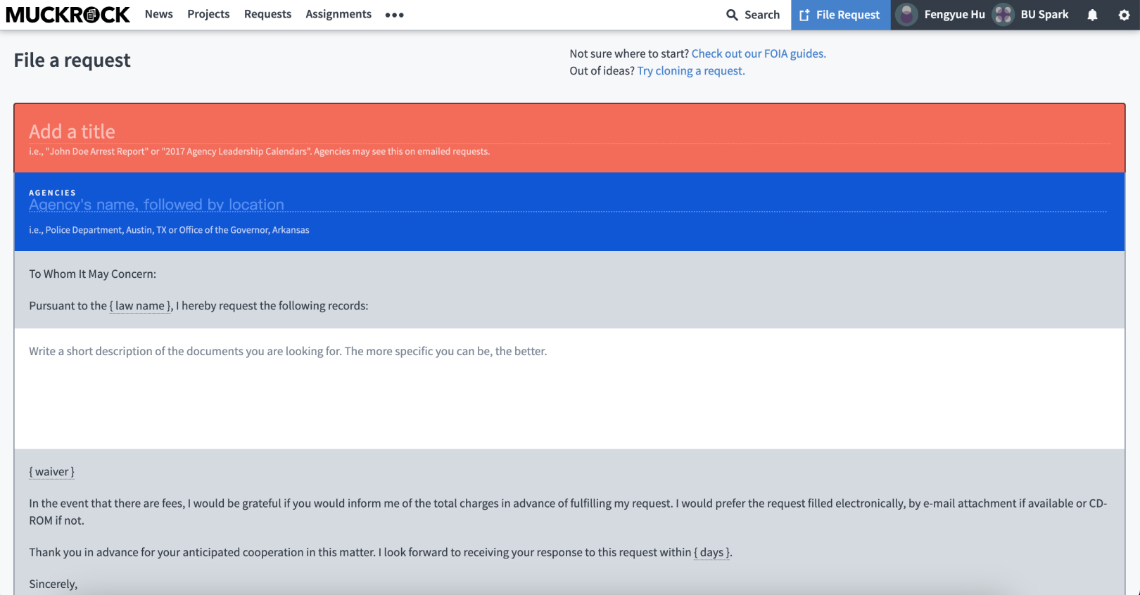
Current Website.
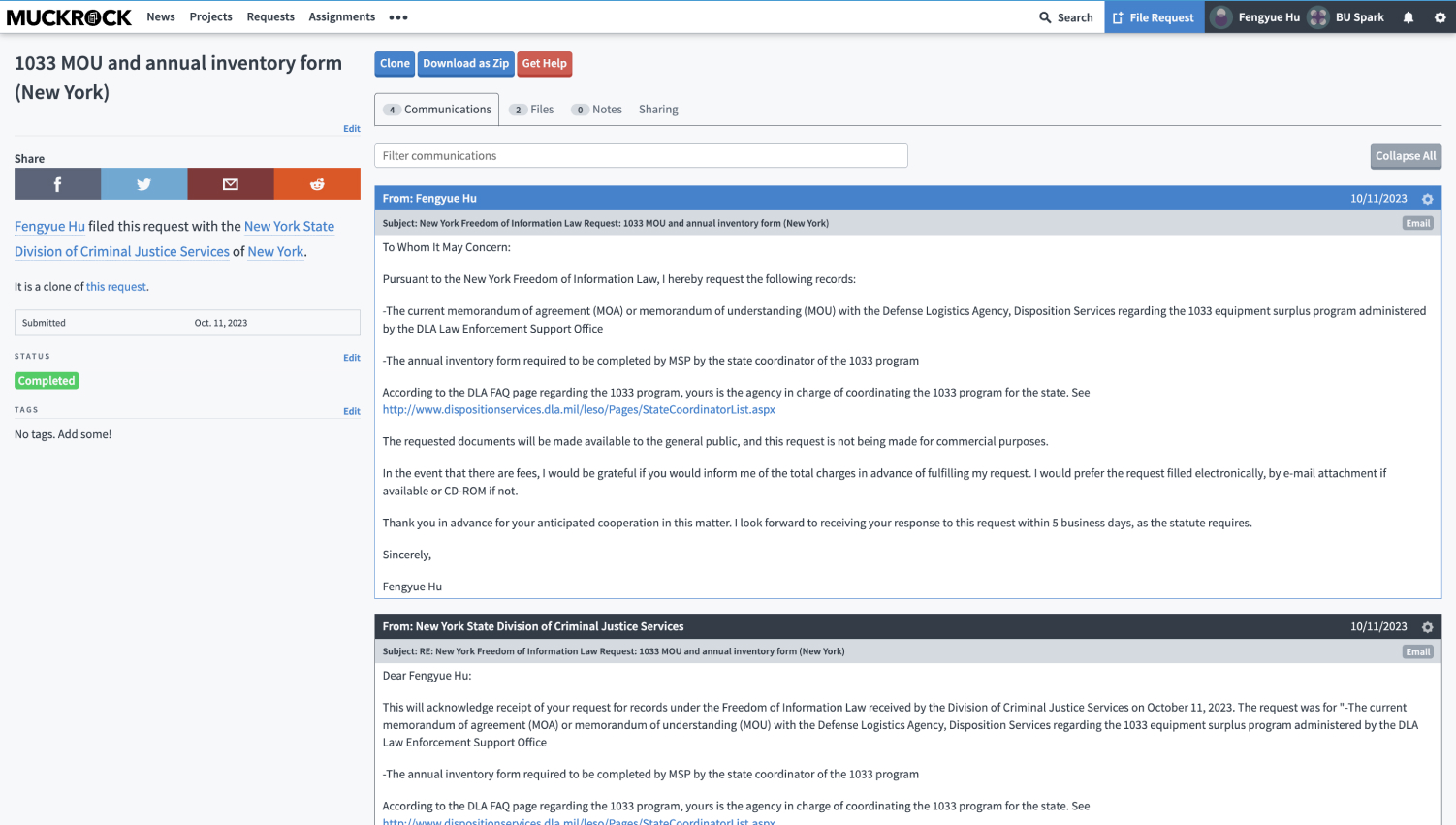
The current design of the website is extremely hard to use without instruction. The page feels congested without a whole lot of white space and essential features like the ‘Edit Template Language’ button is hidden under dropdowns. The individual request page is also hard to follow and even long time users have trouble distinguishing who sent which message.
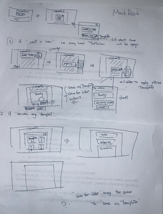
Paper & Lo-Fi Wireframes.
When we were starting our ideation process, we knew we wanted to format the site with something familiar to everyday users. We decided on basing our design off of a traditional e-mail, with a ‘To’ and ‘Subject’ line as well as the same formatting edit bar. We also wanted to make a lot of the hidden features much more prominent, so we put a button on the edit bar specifically for old the ‘Edit Template Language’ checkbox. We also added a dashboard so that users can easily navigate through their drafts or reference old requests as they write.
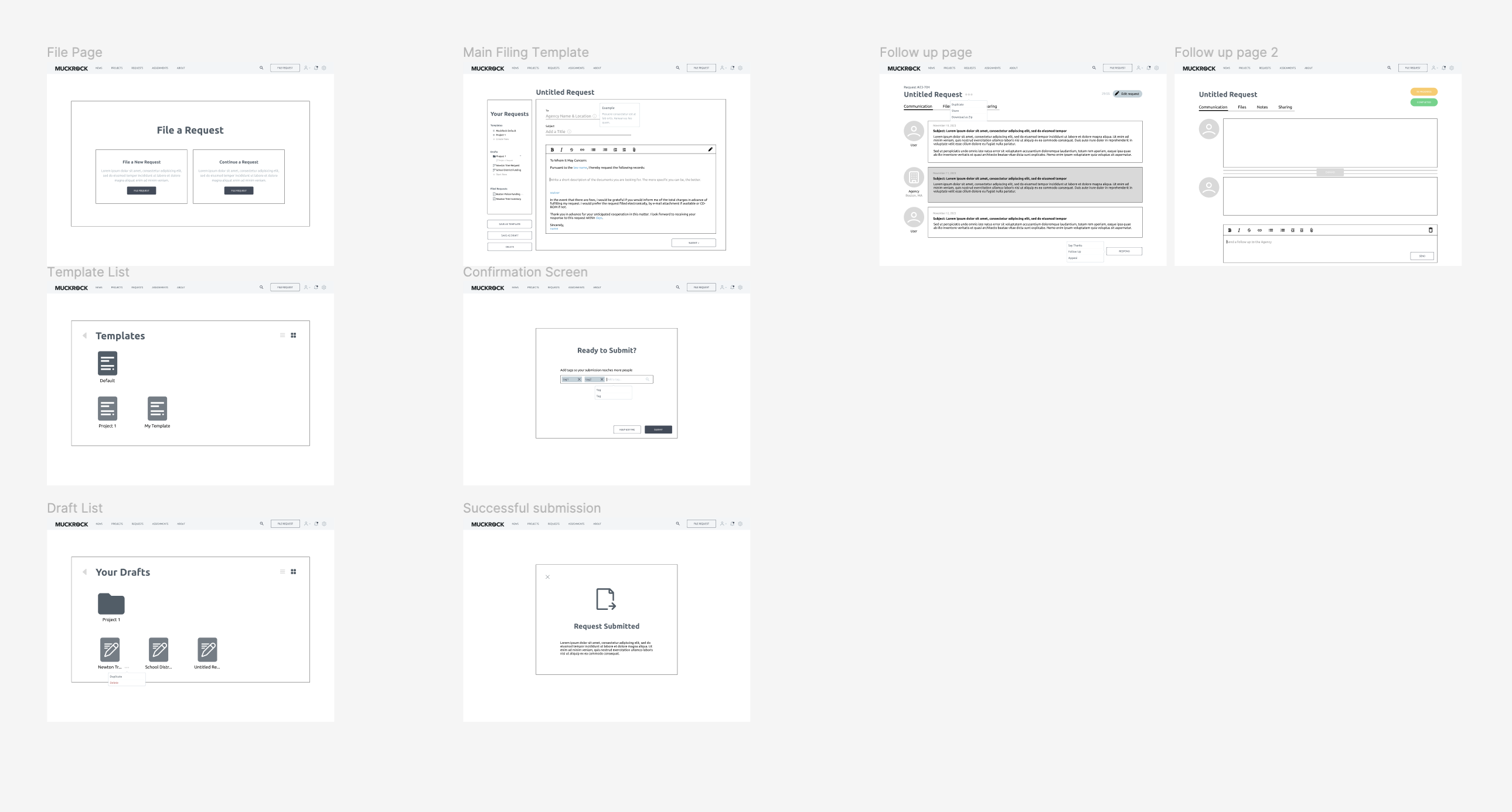
Hi-Fi Wireframes.
When we started on the Hi-Fi wireframes we also decided on a slightly more vibrant color scheme to be up to code with ADA compliance. We also updated the ‘To’ line to specify the government level and made the agency choosing process much more straightforward.
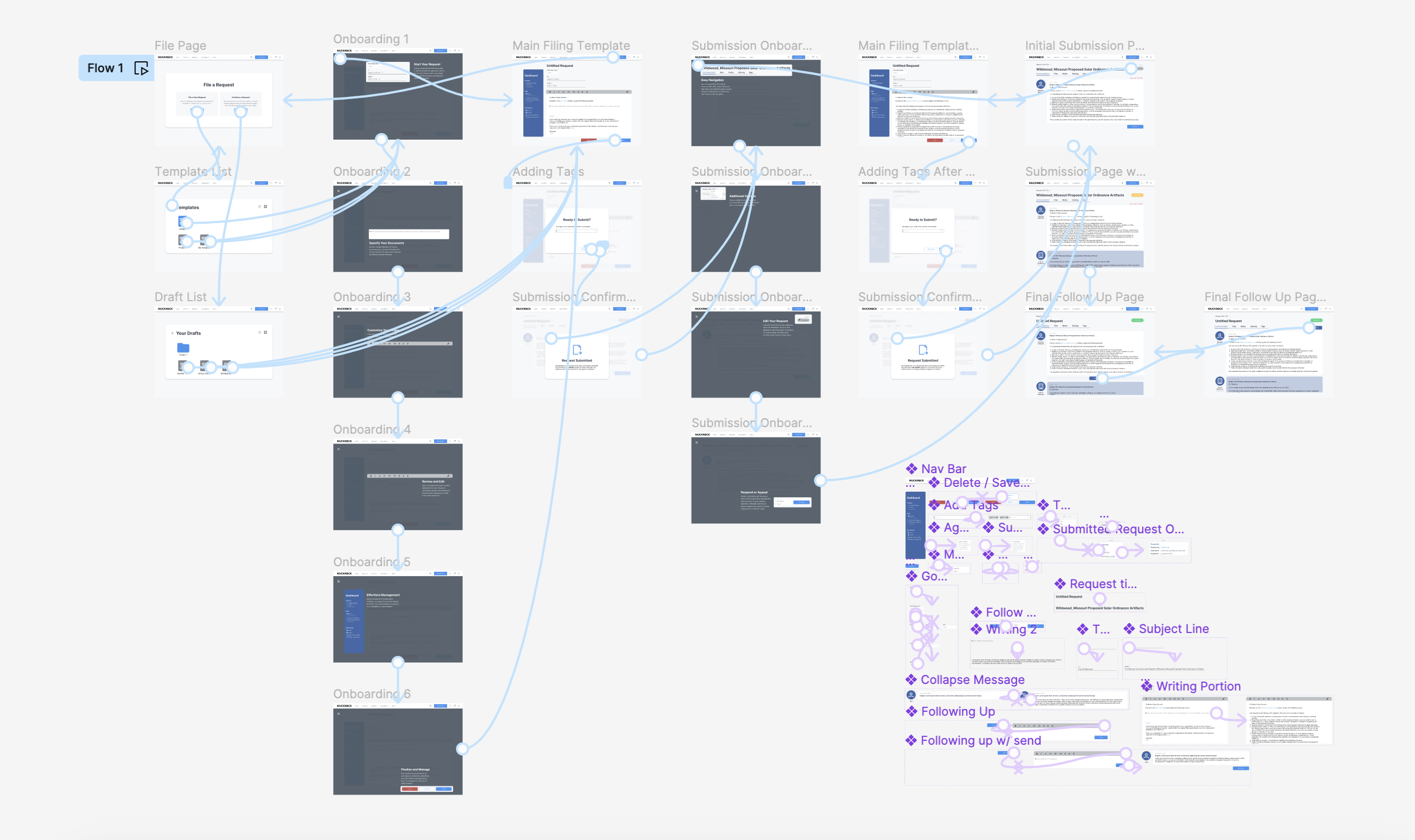
Final Prototype.